

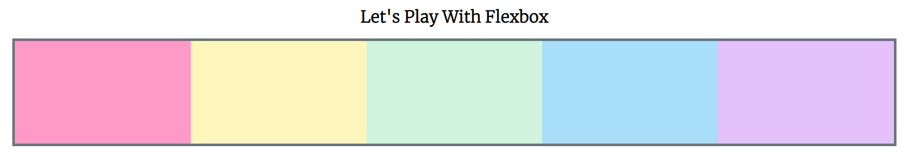
flex sizing properties
공간이 있을때/없을때 어떻게 늘어나고 줄어드는 지 알 수 있다.

body {
    font-family: 'Merriweather', serif;

}

h1 {
    text-align: center;
}

#container  {
    background-color: #6c757d;
    width: 90%;
    /* height: 500px; */
    margin: 0 auto;
    border: 5px solid #6c757d;
    display: flex;
    flex-direction: row;
    justify-content: center;
    flex-wrap: wrap;
}

#container div {
    width: 200px;
    height: 200px;
    text-align: center;
}flex-basis
요소가 배치되기 전에 요소의 최초 크기를 결정한다. 즉, 플렉스 컨테이너에 추가되기 전 시작점과 같은거다.

#container div {
    width: 200px;
    height: 200px;
    text-align: center;
    flex-basis: 400px;
}
flex-basis가 400px인 이상 너비는 완전히 무시된다. 요소가 한줄로 늘어서 있을 때 flex-basis가 너비의 기준이 된다. 그냥 너비를 지정하면 되는데 왜 굳이 flex-basis를 쓰나에 대해 궁금할 수 있다. flex-basis를 사용하는 이유는 가로인 주축에 걸쳐있기 때문이다. 그렇다면 세로로 바꾸게 되면어떻게 될까?
#container  {
    background-color: #6c757d;
    width: 90%;
    /* height: 500px; */
    margin: 0 auto;
    border: 5px solid #6c757d;
    display: flex;
    flex-direction: column;
    justify-content: center;
    flex-wrap: wrap;
}

#container div {
    width: 200px;
    height: 200px;
    text-align: center;
    /* flex-basis: 400px; */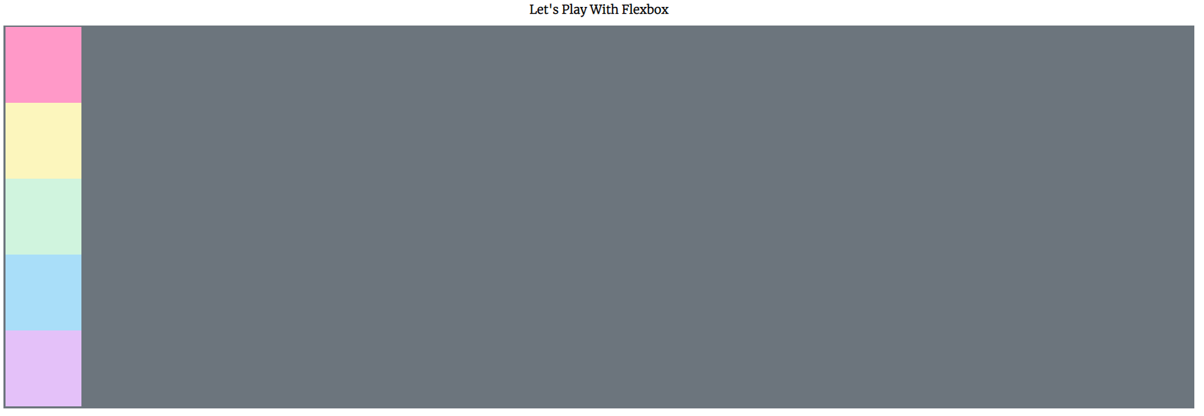
}새로고침하면 여전히 높이는 200px이지만 flex-basis:400px를 하면 ?????

옆의 사진 처럼 나온다.
flex-basis는 요소가 배치될 때의 최초 크기이다. 주축의 방향에 따라 너비도 되고 높이도 된다.
flex-grow
요소가 그 공간을 얼마나 차지할지를 정한다.
#container {
background-color: #6c757d;
width: 90%;
/* height: 500px; */
margin: 0 auto;
border: 5px solid #6c757d;
display: flex;
flex-direction: row;
justify-content: center;
flex-wrap: wrap;
}
#container div {
width: 200px;
height: 200px;
text-align: center;
flex-basis: 200px;
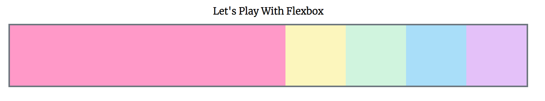
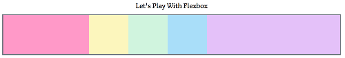
}위의 사진과 같은 경우에는 요소가 남은 공간을 차지하지 않는다. 이럴때 flex-grow 특성을 어떤 요소에서든지 사용할 수 있다.
div:nth-of-type(1) {
    flex-grow: 1;
}flex-grow:1;을 입력하니 핑크색이 나머지 공간을 전체다 채웠다.
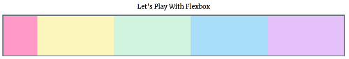
div:nth-of-type(1) {
    flex-grow: 1;
}

div:nth-of-type(5) {
    flex-grow: 1;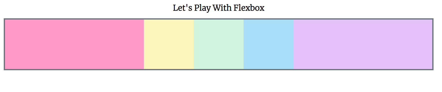
}보라색과 핑크색이 동등하기 자리를 나눠가졌다.
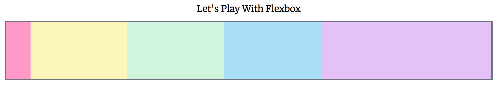
#container div {
    width: 200px;
    height: 200px;
    text-align: center;
    flex-basis: 200px;
    flex-grow: 1;
}

/* div:nth-of-type(1) {
    flex-grow: 1;
}

div:nth-of-type(5) {
    flex-grow: 1;
} */flex-grow:1;을 입력했더니 더 이상 200px 너비가 아니다. 공간을 균등하게 차지했다. 창을 줄이더라도 비율은 동등하게 유지된다.
flex-grow는 다른 요소에 여러 숫자를 부여할 수 있다.
div:nth-of-type(1) {
    flex-grow: 1;
}

div:nth-of-type(5) {
    flex-grow: 2;
}양 끝에 두개다 늘었났지만 보라색은 핑크보다 2배 더 비율을 차지했다. 즉 공간이 분배되는 방법이다. 남은 공간이 있을 때만 커진다.
flex-shrink
컨테이너에 충분한 공간이 없을 때 요소들이 줄어드는 비율을 통제해준다.
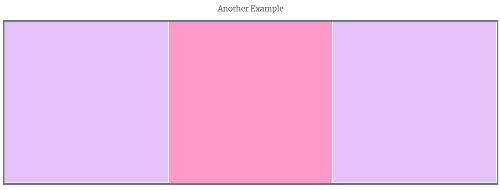
#container div {
    width: 200px;
    height: 200px;
    text-align: center;
    flex-basis: 600px;
    /* flex-grow: 1; */
}

div:nth-of-type(1) {
    flex-grow: 1;
    flex-shrink: 2;
}
div:nth-of-type(5) {
    flex-grow: 2;
    flex-shrink: 0;
}
창을 작게 했더니 첫번재 네모를 포함해 나머지 네모들은 줄어들었다. 첫번재 핑크색은 확 줄어들었다. 나머지는 디폴트가 1이라서 모두 동일한 비율로 줄어드는 것이다.
Flex
three values: flex-grow | flex-shrink | flex-basis
two values: flex-grow | flex-shrink
두가지 값이 있지만 그 중 하나가 너비거나 px거나 em이면 flex-grow | flex-basis
one value: 숫자가 아닌 값 1개나 단위가 없는 숫자라면 기본적으로 flex-grow를 사용한다.
<!DOCTYPE html>
<html lang="en">
<head>
<meta charset="UTF-8">
<meta http-equiv="X-UA-Compatible" content="IE=edge">
<meta name="viewport" content="width=device-width, initial-scale=1.0">
<title>Flexbox</title>
<link rel="stylesheet" href="flexbox.css">
<link rel="preconnect" href="https://fonts.googleapis.com">
<link rel="preconnect" href="https://fonts.gstatic.com" crossorigin>
<link href="https://fonts.googleapis.com/css2?family=Merriweather:wght@300&display=swap" rel="stylesheet">
</head>
<body>
<h1>Let's Play With Flexbox</h1>
<section id="container">
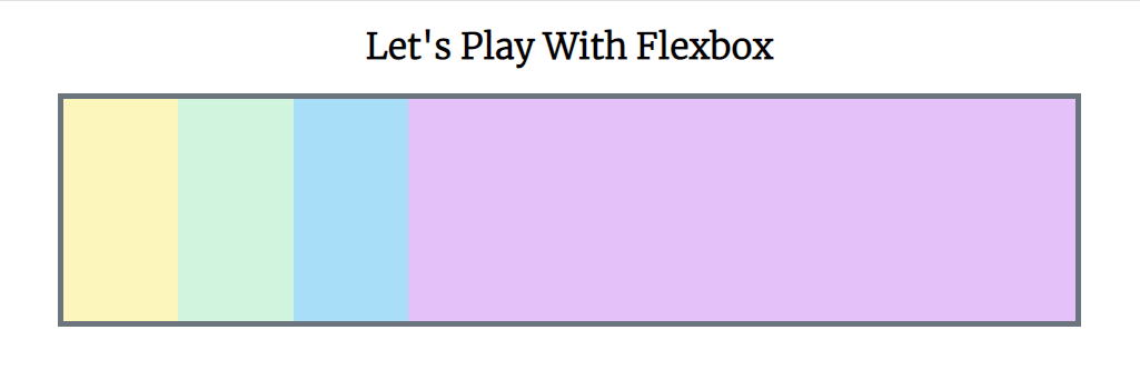
<div style="background-color: #ff99c8;"></div>
<div style="background-color: #fcf6bd;"></div>
<div style="background-color: #d0f4de;"></div>
<div style="background-color: #a9def9;"></div>
<div style="background-color: #e4c1f9;"></div>
</section>
<h2>Another Example</h2>
<main>
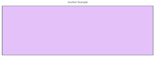
<section class="sidebar"></section>
<section class="maincontent"></section>
<section class="sidebar"></section>
</main>
</body>
</html>
body {
    font-family: 'Merriweather', serif;

}

h1, h2 {
    text-align: center;
}

#container  {
    background-color: #6c757d;
    width: 90%;
    /* height: 500px; */
    margin: 0 auto;
    border: 5px solid #6c757d;
    display: flex;
    flex-direction: row;
    justify-content: center;
    /* flex-wrap: wrap; */
}

#container div {
    width: 200px;
    height: 200px;
    text-align: center;
    flex-basis: 600px;
    /* flex-grow: 1; */
}

div:nth-of-type(1) {
    flex-grow: 1;
    flex-shrink: 2;
}

div:nth-of-type(5) {
    flex-grow: 2;
    flex-shrink: 0;
}

h1, h2 {
    color: #6c757d;
}

main {
    width: 80%;
    margin: 0 auto;
    border:  5px solid #6c757d;
    height: 500px;
    display: flex;
}

main .sidebar{
    background-color: #e4c1f9;
    flex: 1;
}

main .maincontent{
    background-color: #ff99c8;
}
위아래 보라색 sidebar 2개는 티가 안나지만 2px 짜리 하얀 실선을 만들면 두개의 요소인것을 알 수 있다. 너비가 없는 main-content는 flex를 1로 설정하면 똑같은 flex-grow로 취급된다. flex-basis를 설정 안해서 전부 동일한 크기가 되었다.
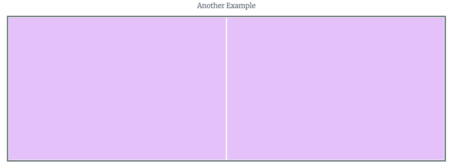
main .sidebar{
    background-color: #e4c1f9;
    flex: 1;
    border: 2px solid white;
}
border 값을 입력했더니 2개의 요소인것을 알 수 있다.
main .maincontent{
    background-color: #ff99c8;
    flex: 1;
}
flex-basis를 설정 안해서 전부 동일한 크기가 되었다.
'📦 CSS > CSS' 카테고리의 다른 글
| [CSS] 레이아웃 (0) | 2023.01.24 |
|---|---|
| Responsive design, Media queries (0) | 2022.12.01 |
| [CSS] align-content | align-self (0) | 2022.11.30 |
| [CSS] Flexbox 속성 | align-items (0) | 2022.11.28 |
| [CSS] Flexbox 속성 ③ | flex-wrap: wrap; | flex-wrap: wrap-reserve; | flex-wrap: nowrap; (1) | 2022.11.28 |