

728x90

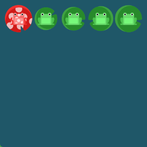
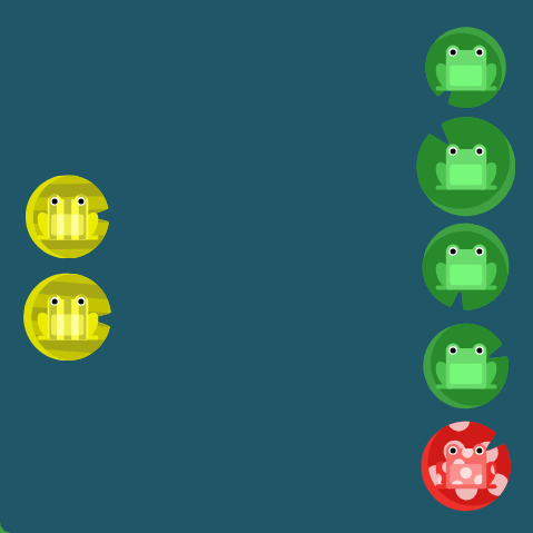
1단계

#pond {
  display: flex;
justify-content: flex-end;
}
2단계

#pond {
  display: flex;
justify-content: flex-end;
}
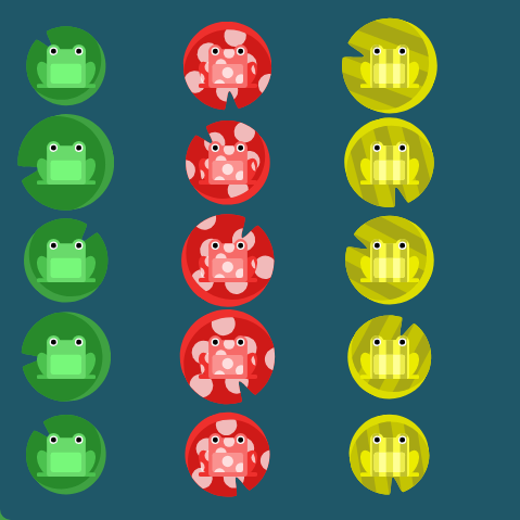
3단계

#pond {
  display: flex;
justify-content: space-around;
}
4단계

#pond {
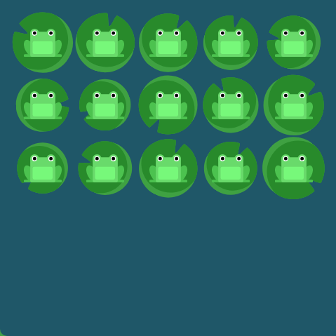
display: flex;
justify-content: space-between;
}
5단계

#pond {
  display: flex;
align-items: flex-end;
}
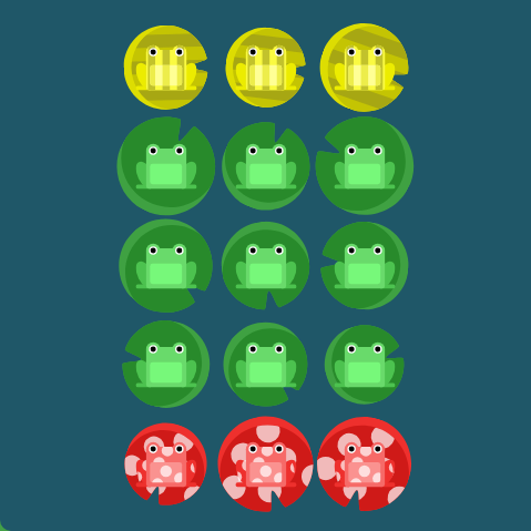
6단계

#pond {
  display: flex;
justify-content: center;
align-items: center;
}
7단계

#pond {
  display: flex;
justify-content: space-around;
align-items: flex-end;
}
8단계

#pond {
  display: flex;
flex-direction: row-reverse;
}
9단계

#pond {
  display: flex;
flex-direction: column;
}
10단계

#pond {
  display: flex;
flex-direction: row-reverse;
justify-content: flex-end;
}
11단계

#pond {
  display: flex;
flex-direction: column;
justify-content: flex-end;
}
12단계

#pond {
  display: flex;
flex-direction: column-reverse;
justify-content: space-between;
}
13단계

#pond {
  display: flex;
flex-direction: row-reverse;
justify-content: center;
align-items: flex-end;
}
14단계

#pond {
  display: flex;
}

.yellow {
order: 1;
}
15단계
#pond {
  display: flex;
}

.red {
order:-3;
}
16단계

#pond {
  display: flex;
  align-items: flex-start;
}

.yellow {
align-self: flex-end;
}
17단계

#pond {
  display: flex;
  align-items: flex-start;
}

.yellow {
order: 4;
align-self: flex-end;
}
18단계

#pond {
  display: flex;
flex-wrap: wrap;
}
19단계
#pond {
  display: flex;
flex-direction: column;
flex-wrap: wrap;
}
20단계

#pond {
  display: flex;
flex-flow: column wrap;
}
21단계
#pond {
  display: flex;
  flex-wrap: wrap;
align-content: flex-start;
}
22단계

#pond {
  display: flex;
  flex-wrap: wrap;
align-content:flex-end;
}
23단계
#pond {
  display: flex;
  flex-wrap: wrap;
flex-direction: column-reverse;
align-content: center;
}
24단
#pond {
  display: flex;
flex-direction: column-reverse;
flex-wrap: wrap-reverse;
justify-content: center;
align-content: space-between;
}
728x90
'📦 CSS' 카테고리의 다른 글
| [CSS 궁금증] img 속성과 background-image 속성의 주요 차이점 (0) | 2024.01.08 |
|---|