

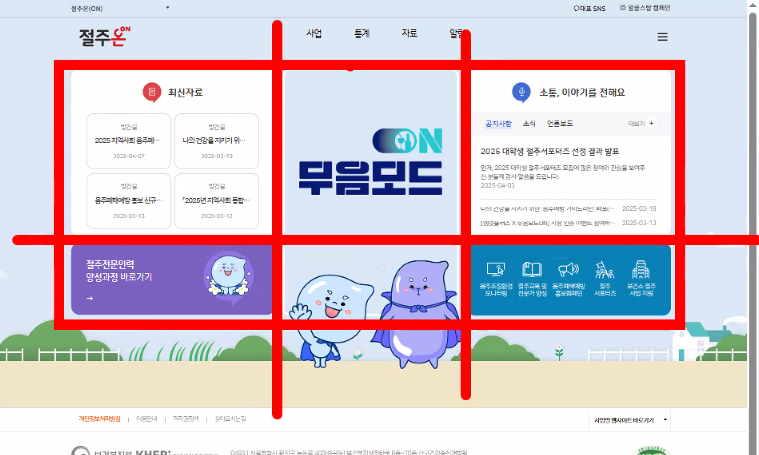
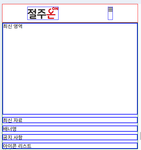
html 구조도는 html 중요도에 따라 작성하면 된다.
section이나 article요소에도 h도 쓰인다.
최신 자료가 article영역이거나 banner가 section이면 h가 필요하다.
관공서 사이트가 웹 표준을 잘 지킨다.
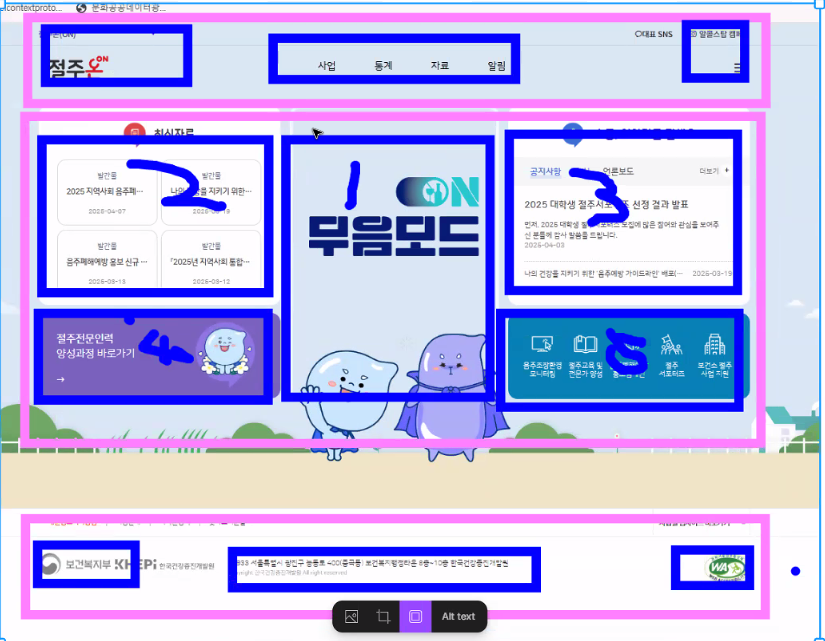
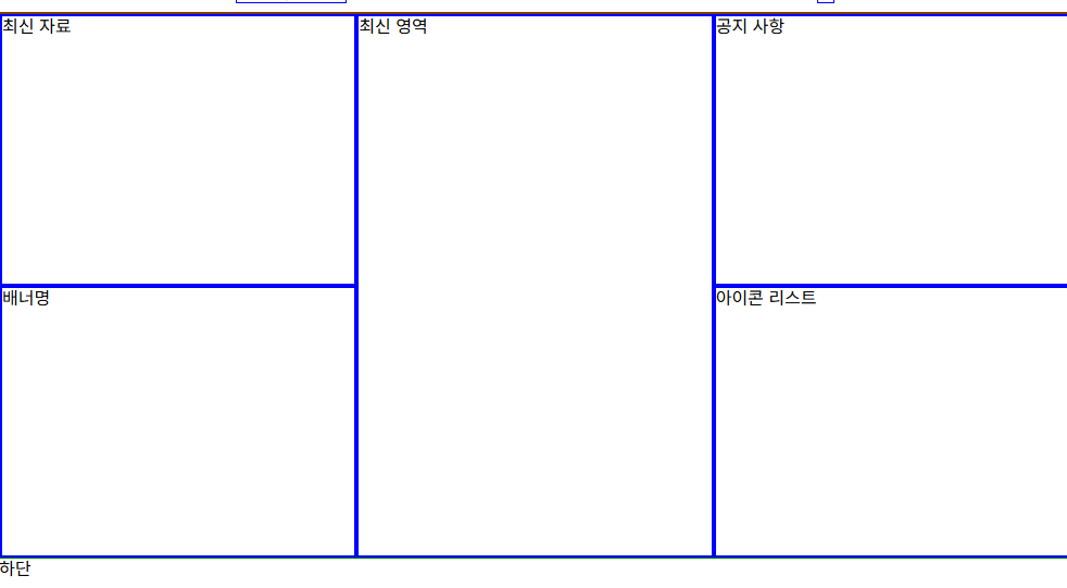
이런식으로 화면 구성을 나눌 수 있다.
각각의 필요한 이미지를 개발자 도구를 통해서 다운받으면 된다.
png는 배경이 투명한 것을 허용한다.
css는 중요도가 높은 것을 밑에 작성해야된다.
cdnjs - The #1 free and open source CDN built to make life easier for developers
cdnjs - The #1 free and open source CDN built to make life easier for developers
Simple. Fast. Reliable. Content delivery at its finest. cdnjs is a free and open-source CDN service trusted by over 12.5% of all websites, serving over 200 billion requests each month, powered by Cloudflare. We make it faster and easier to load library fil
cdnjs.com
주요 기본 링크들을 가져올 수 있다.
<!DOCTYPE html>
<html lang="en">
  <head>
    <meta charset="UTF-8" />
    <meta name="viewport" content="width=device-width, initial-scale=1.0" />
    <link
      rel="stylesheet"
      href="https://cdnjs.cloudflare.com/ajax/libs/meyer-reset/2.0/reset.min.css"
      integrity="sha512-NmLkDIU1C/C88wi324HBc+S2kLhi08PN5GDeUVVVC/BVt/9Izdsc9SVeVfA1UZbY3sHUlDSyRXhCzHfr6hmPPw=="
      crossorigin="anonymous"
      referrerpolicy="no-referrer"
    />

    <link
      rel="stylesheet"
      href="https://cdnjs.cloudflare.com/ajax/libs/font-awesome/6.7.2/css/all.min.css"
      integrity="sha512-Evv84Mr4kqVGRNSgIGL/F/aIDqQb7xQ2vcrdIwxfjThSH8CSR7PBEakCr51Ck+w+/U6swU2Im1vVX0SVk9ABhg=="
      crossorigin="anonymous"
      referrerpolicy="no-referrer"
    />
    <title>파일 명</title>
  </head>
  <body></body>
</html>
코드조각-html.json을 찾아서 !를 칠때 원하는 기본 html이 나오도록 변경할 수 있다.
png 파일보단 svg 파일이 좋다. svg는 확대를 하더라고 그 모양을 유지한다. ( svg는 코드로 되어있는 이미지이다.)
png는 배경이 투명해야할 경우 다운 받으면 좋다.
a → 블록 요소로 담을 수 있지만 권장 하지 않는다 .
div 막 쓰기 가능
인라인이 span
inline특징
apdding은 위아래만된다.
displaysms layout을 정리할 부모 요소에 붙인다.
자식들(컨테이너들)은 아이템이 된다.
justify-content는 메인축 에 관련된 정렬 (row가 기본)
크로슨ㄴ align
rem -> font size
:root {
font-size: 10px}
로 해 놓으면 1rem=10px
그렇지않으면 1rem은 16px
control+shift 방향기하면 원하는 단어로 드래그된다.
<!DOCTYPE html>
<html lang="ko">
  <head>
    <meta charset="UTF-8" />
    <meta name="viewport" content="width=device-width, initial-scale=1.0" />
    <title>test</title>
    <link
      rel="stylesheet"
      href="https://cdnjs.cloudflare.com/ajax/libs/meyer-reset/2.0/reset.min.css"
      integrity="sha512-NmLkDIU1C/C88wi324HBc+S2kLhi08PN5GDeUVVVC/BVt/9Izdsc9SVeVfA1UZbY3sHUlDSyRXhCzHfr6hmPPw=="
      crossorigin="anonymous"
      referrerpolicy="no-referrer"
    />
    <link
      rel="stylesheet"
      href="https://cdnjs.cloudflare.com/ajax/libs/font-awesome/6.7.2/css/all.min.css"
      integrity="sha512-Evv84Mr4kqVGRNSgIGL/F/aIDqQb7xQ2vcrdIwxfjThSH8CSR7PBEakCr51Ck+w+/U6swU2Im1vVX0SVk9ABhg=="
      crossorigin="anonymous"
      referrerpolicy="no-referrer"
    />
    <link rel="stylesheet" href="./style.css" />
  </head>
  <body>
    <header class="hd">
      <h1>
        <!-- svg코드는 자신만의 사이즈가 있다. -->
        <!-- img의 부모는 a이다. -->
        <a href="#"><img src="./img/logo.svg" alt="로고" /></a>
      </h1>
      <!-- <p><span>임시</span><i>텍스트</i></p> -->
      <nav>
        <!-- ul 하위는 li만 된다. -->
        <ul class="gnb">
          <li>
            <a href="#">메뉴</a>
            <!-- <ul>
              <li><a href="#">서브</a></li>
              <li><a href="#">서브</a></li>
              <li><a href="#">서브</a></li>
            </ul> -->
          </li>

          <li><a href="#">메뉴</a></li>
          <li><a href="#">메뉴</a></li>
        </ul>
      </nav>
      <i class="fa-solid fa-bars"></i>
    </header>
    <main>컨텐츠 영역</main>
    <footer>하단</footer>
  </body>
</html>:root {
/* font-size: 10px; */
}
* {
/* 넓이를 설정할때 border의 영역까지를 합친다. */
box-sizing: border-box;
}
a {
text-decoration: none;
color: inherit;
}
li {
list-style: none;
}
/* 대표 녀석이 있으면 이렇게 분리하는게 좋다. */
.hd {
border: 1px solid red;
/* 옆으로 나열 */
display: flex;
justify-content: space-around;
padding: 0.5rem;
max-width: 1200px;
width: calc(100%, -4rem);
margin: 0 auto;
}
/* hd 하위의 집게 태그를 나타내는것 */
.hd > * {
border: 1px solid blue;
}
/* 사이즈가 유동적일때는 자식요소에 사이즈를 넣는 것이 좋다 */
/* 로고의 사이지만 좋을뿐인데 자동으로 늘어났다. */
/* 높이나 넓이 둘 중 하나의 사이즈를 넣는 것이 좋다. */
.hd h1 > a {
display: block;
width: 100px;
}
/* 요소명 */
/* 아래쪽에 있어서 덮어쓰기 불가능 */
.hd nav {
border-color: lightcoral !important;
}
nav .gnb {
display: flex;
gap: 1rem;
}
nav .gnb .a {
display: block;
padding: 0.5rem 1rem;
}
nav .gnb a:hover,
nav .gnb a:focus {
background-color: lightcoral;
outline: none;
}
nav .fa-bars {
cursor: pointer;
/* 호버 이전에 transition을 주는게 좋다. */
transition: 0.3s;
}
/** CSS 점수 체계 - 스타일 적용 순서 적용
* 요소명1
* class 10
* id 100
* style 1000
* !important 무한대
*
* 점수를 높이면 우선순위를 설정할 수 있다.
*/
/* 반응형 모바일 만들기 */
@media (max-width: 1100px) {
nav {
display: none;
}
}
컨텐츠의 중요도 순위로 html을 작성한다.
바둑판 형태로 할때 grid로 쓰면 된다.
main은 html에서 1번만 사용한다.
3단과 2단으로 구성됨
/* 3단으로 나누고 1:1:1 비율로 나눈다. */
grid-template-columns: repeat(3, calc(100% / 3 - 0.5rem));
grid-template-rows: repeat(2, auto);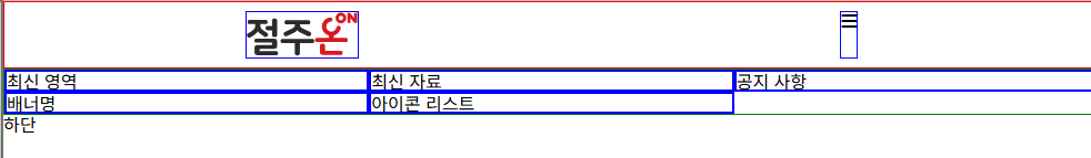
칸을 합칠 수도 있다.
/* 줄 번호로 설정함 */
main h2 {
grid-column: 2/3;
grid-row: 1/3;
}
높이는 컨텐츠에 의해 자동으로 늘어난다.
main h2 {
grid-column: 2/3;
grid-row: 1/3;
height: 500px;
}
/* .new,
.notice {
height: 300px;
}
.banner,
.icon {
height: 150px;
} */
모바일일때
@media (max-width: 600px) {
main {
display: flex;
flex-direction: column;
gap: 0.5rem;
}
.notice {
/* order가 클수록 아래쪽에 배치한다. */
order: 4;
}
.icon {
order: 5;
}
}
가상 태그를 활용해서 디자인 마무리하기
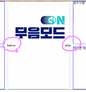
before과 after는 사진과 같이 나타난다.
<!DOCTYPE html>
<html lang="ko">
<head>
<meta charset="UTF-8" />
<meta name="viewport" content="width=device-width, initial-scale=1.0" />
<title>test</title>
<link
rel="stylesheet"
href="https://cdnjs.cloudflare.com/ajax/libs/meyer-reset/2.0/reset.min.css"
integrity="sha512-NmLkDIU1C/C88wi324HBc+S2kLhi08PN5GDeUVVVC/BVt/9Izdsc9SVeVfA1UZbY3sHUlDSyRXhCzHfr6hmPPw=="
crossorigin="anonymous"
referrerpolicy="no-referrer"
/>
<link
rel="stylesheet"
href="https://cdnjs.cloudflare.com/ajax/libs/font-awesome/6.7.2/css/all.min.css"
integrity="sha512-Evv84Mr4kqVGRNSgIGL/F/aIDqQb7xQ2vcrdIwxfjThSH8CSR7PBEakCr51Ck+w+/U6swU2Im1vVX0SVk9ABhg=="
crossorigin="anonymous"
referrerpolicy="no-referrer"
/>
<link rel="stylesheet" href="./style.css" />
</head>
<body>
<header class="hd mw">
<h1>
<!-- svg코드는 자신만의 사이즈가 있다. -->
<!-- img의 부모는 a이다. -->
<a href="#"><img src="./img/logo.svg" alt="로고" /></a>
</h1>
<!-- <p><span>임시</span><i>텍스트</i></p> -->
<nav>
<!-- ul 하위는 li만 된다. -->
<ul class="gnb">
<li>
<a href="#">메뉴</a>
<!-- <ul>
<li><a href="#">서브</a></li>
<li><a href="#">서브</a></li>
<li><a href="#">서브</a></li>
</ul> -->
</li>
<li><a href="#">메뉴</a></li>
<li><a href="#">메뉴</a></li>
</ul>
</nav>
<i class="fa-solid fa-bars"></i>
</header>
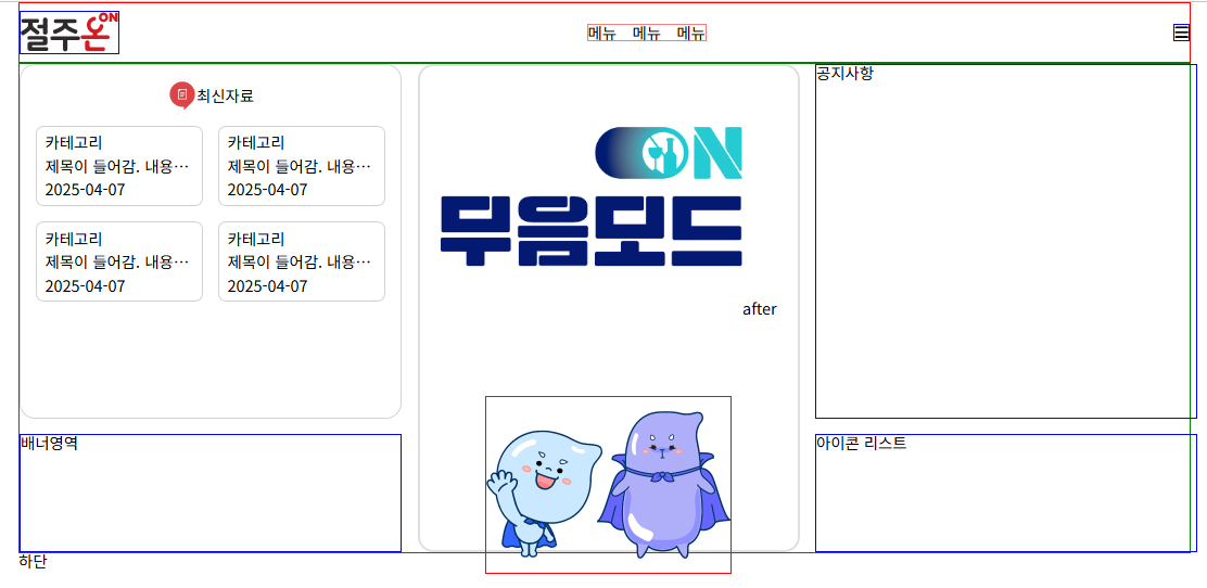
<main class="mw">
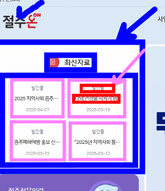
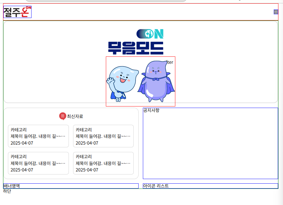
<h2><img src="./img/acs_visual.png" alt="무음모드" /></h2>
<section class="new">
<h3>최신자료</h3>
<ul class="news-list">
<li>
<span>카테고리</span>
<p>
제목이 들어감. 내용이 길~~~~~ 수 있어요~~~ Lorem ipsum dolor, sit
amet consectetur adipisicing elit. Nesciunt magnam aliquam
consequuntur, amet autem neque ut maiores laborum blanditiis nobis
provident labore alias necessitatibus iste perferendis commodi
praesentium quos at.
</p>
<time>2025-04-07</time>
</li>
</ul>
</section>
<section class="notice">공지사항</section>
<div class="banner">배너영역</div>
<div class="icon">아이콘 리스트</div>
</main>
<footer class="mw">하단</footer>
</body>
</html>:root {
/* font-size: 10px; */
}
* {
/* 넓이를 설정할때 border의 영역까지를 합친다. */
box-sizing: border-box;
}
a {
text-decoration: none;
color: inherit;
}
li {
list-style: none;
}
/* 공통된 녀석들 */
.mw {
max-width: 1200px;
width: calc(100% - 4rem);
margin: auto;
}
/* 대표 녀석이 있으면 이렇게 분리하는게 좋다. */
.hd {
border: 1px solid red;
/* 옆으로 나열 */
display: flex;
justify-content: space-between;
align-items: center;
padding: 0.5rem 0;
}
/* hd 하위의 집게 태그를 나타내는것 */
.hd > * {
border: 1px solid blue;
}
/* 사이즈가 유동적일때는 자식요소에 사이즈를 넣는 것이 좋다 */
/* 로고의 사이지만 좋을뿐인데 자동으로 늘어났다. */
/* 높이나 넓이 둘 중 하나의 사이즈를 넣는 것이 좋다. */
.hd h1 > a {
display: block;
width: 100px;
}
/* 요소명 */
/* 아래쪽에 있어서 덮어쓰기 불가능 */
.hd nav {
border-color: lightcoral !important;
}
nav .gnb {
display: flex;
gap: 1rem;
}
nav .gnb .a {
display: block;
padding: 0.5rem 1rem;
}
nav .gnb a:hover,
nav .gnb a:focus {
background-color: lightcoral;
outline: none;
}
nav .fa-bars {
cursor: pointer;
/* 호버 이전에 transition을 주는게 좋다. */
transition: 0.3s;
}
.fa-bars:hover {
color: red;
}
/** CSS 점수 체계 - 스타일 적용 순서 적용
* 요소명1
* class 10
* id 100
* style 1000
* !important 무한대
*
* 점수를 높이면 우선순위를 설정할 수 있다.
*/
/* 반응형 모바일 만들기 */
@media (max-width: 1100px) {
nav {
display: none;
}
}
/* main */
main {
/* grid는 행렬을 만든다 */
border: 1px solid green;
display: grid;
/* 3단으로 나누고 1:1:1 비율로 나눈다. */
grid-template-columns: repeat(3, calc(100% / 3 - 0.5rem));
grid-template-rows: repeat(2, auto);
gap: 1rem;
}
main > * {
border: 2px solid blue;
}
/* 줄 번호로 설정함 */
main h2 {
grid-column: 2/3;
grid-row: 1/3;
height: 500px;
border: 3px solid rgb(223, 223, 223);
border-radius: 1rem;
display: flex;
justify-content: center;
align-items: center;
position: relative;
}
main h2 img {
width: 80%;
transform: translateY(-80%);
}
main h2::before {
/* 가상요소는 content가 항상 따라온다 */
/* 반응형은 상대단위로 한다. */
content: '';
display: block;
border: 1px solid red;
position: absolute;
bottom: -5%;
width: 250px;
padding-top: 180px;
background-image: url('../img/campaign_character.png');
background-size: contain;
background-position: center;
background-repeat: no-repeat;
}
main h2::after {
content: 'after';
}
/* .new,
.notice {
height: 300px;
}
.banner,
.icon {
height: 150px;
} */
/* 반응형 모바일 만들기 */
@media (max-width: 1100px) {
main {
/* 비율로 적용된 사이즈를 %로 변경 */
grid-template-columns: repeat(2, calc(50% - 0.5rem));
grid-template-rows: repeat(3, auto);
}
main h2 {
grid-column: 1/3;
grid-row: 1/2;
height: 300px;
}
main h2 img {
width: 200px;
}
}
@media (max-width: 600px) {
main {
display: flex;
flex-direction: column;
gap: 0.5rem;
}
.notice {
/* order가 클수록 아래쪽에 배치한다. */
order: 4;
}
.icon {
order: 5;
}
}
/* new */
.new {
padding: 1rem;
border: 2px solid lightgray;
border-radius: 1rem;
}
.new h3 {
display: flex;
align-items: center;
justify-content: center;
padding-bottom: 1rem;
}
.new h3::before {
content: '';
display: inline-block;
width: 30px;
height: 30px;
background: url('../img/red_comma.png') no-repeat center;
background-size: contain;
}
.new .news-list {
display: flex;
flex-wrap: wrap;
gap: 1rem;
}
.new li {
border: 1px solid lightgray;
border-radius: 0.5rem;
width: calc(50% - 0.5rem);
display: flex;
flex-direction: column;
gap: 0.5rem;
padding: 0.5rem;
}
.new li p {
width: 100%;
white-space: nowrap;
overflow: hidden;
text-overflow: ellipsis;
}
*코드의 변경사항은 좀 있다.
반응형을 통해 웹 사이트의 사이즈가 변화되게 만들었다.
'💡 URECA > 🗒️ 스터디 노트' 카테고리의 다른 글
| [URECA] 가위바위보 프로젝트 (0) | 2025.04.10 |
|---|---|
| [URECA] Day 49 React 복기 (0) | 2025.04.08 |
| [URECA] Day47 피그마 → HTML 변환 (0) | 2025.04.03 |
| [URECA] Day 46 React 컴포넌트 (0) | 2025.04.02 |
| [URECA] Day 45 React (리액트 특징, JSX) (0) | 2025.04.01 |
html 구조도는 html 중요도에 따라 작성하면 된다.
section이나 article요소에도 h도 쓰인다.
최신 자료가 article영역이거나 banner가 section이면 h가 필요하다.
관공서 사이트가 웹 표준을 잘 지킨다.
이런식으로 화면 구성을 나눌 수 있다.
각각의 필요한 이미지를 개발자 도구를 통해서 다운받으면 된다.
png는 배경이 투명한 것을 허용한다.
css는 중요도가 높은 것을 밑에 작성해야된다.
cdnjs - The #1 free and open source CDN built to make life easier for developers
cdnjs - The #1 free and open source CDN built to make life easier for developers
Simple. Fast. Reliable. Content delivery at its finest. cdnjs is a free and open-source CDN service trusted by over 12.5% of all websites, serving over 200 billion requests each month, powered by Cloudflare. We make it faster and easier to load library fil
cdnjs.com
주요 기본 링크들을 가져올 수 있다.
<!DOCTYPE html>
<html lang="en">
<head>
<meta charset="UTF-8" />
<meta name="viewport" content="width=device-width, initial-scale=1.0" />
<link
rel="stylesheet"
href="https://cdnjs.cloudflare.com/ajax/libs/meyer-reset/2.0/reset.min.css"
integrity="sha512-NmLkDIU1C/C88wi324HBc+S2kLhi08PN5GDeUVVVC/BVt/9Izdsc9SVeVfA1UZbY3sHUlDSyRXhCzHfr6hmPPw=="
crossorigin="anonymous"
referrerpolicy="no-referrer"
/>
<link
rel="stylesheet"
href="https://cdnjs.cloudflare.com/ajax/libs/font-awesome/6.7.2/css/all.min.css"
integrity="sha512-Evv84Mr4kqVGRNSgIGL/F/aIDqQb7xQ2vcrdIwxfjThSH8CSR7PBEakCr51Ck+w+/U6swU2Im1vVX0SVk9ABhg=="
crossorigin="anonymous"
referrerpolicy="no-referrer"
/>
<title>파일 명</title>
</head>
<body></body>
</html>
코드조각-html.json을 찾아서 !를 칠때 원하는 기본 html이 나오도록 변경할 수 있다.
png 파일보단 svg 파일이 좋다. svg는 확대를 하더라고 그 모양을 유지한다. ( svg는 코드로 되어있는 이미지이다.)
png는 배경이 투명해야할 경우 다운 받으면 좋다.
a → 블록 요소로 담을 수 있지만 권장 하지 않는다 .
div 막 쓰기 가능
인라인이 span
inline특징
apdding은 위아래만된다.
displaysms layout을 정리할 부모 요소에 붙인다.
자식들(컨테이너들)은 아이템이 된다.
justify-content는 메인축 에 관련된 정렬 (row가 기본)
크로슨ㄴ align
rem -> font size
:root {
font-size: 10px}
로 해 놓으면 1rem=10px
그렇지않으면 1rem은 16px
control+shift 방향기하면 원하는 단어로 드래그된다.
<!DOCTYPE html>
<html lang="ko">
<head>
<meta charset="UTF-8" />
<meta name="viewport" content="width=device-width, initial-scale=1.0" />
<title>test</title>
<link
rel="stylesheet"
href="https://cdnjs.cloudflare.com/ajax/libs/meyer-reset/2.0/reset.min.css"
integrity="sha512-NmLkDIU1C/C88wi324HBc+S2kLhi08PN5GDeUVVVC/BVt/9Izdsc9SVeVfA1UZbY3sHUlDSyRXhCzHfr6hmPPw=="
crossorigin="anonymous"
referrerpolicy="no-referrer"
/>
<link
rel="stylesheet"
href="https://cdnjs.cloudflare.com/ajax/libs/font-awesome/6.7.2/css/all.min.css"
integrity="sha512-Evv84Mr4kqVGRNSgIGL/F/aIDqQb7xQ2vcrdIwxfjThSH8CSR7PBEakCr51Ck+w+/U6swU2Im1vVX0SVk9ABhg=="
crossorigin="anonymous"
referrerpolicy="no-referrer"
/>
<link rel="stylesheet" href="./style.css" />
</head>
<body>
<header class="hd">
<h1>
<!-- svg코드는 자신만의 사이즈가 있다. -->
<!-- img의 부모는 a이다. -->
<a href="#"><img src="./img/logo.svg" alt="로고" /></a>
</h1>
<!-- <p><span>임시</span><i>텍스트</i></p> -->
<nav>
<!-- ul 하위는 li만 된다. -->
<ul class="gnb">
<li>
<a href="#">메뉴</a>
<!-- <ul>
<li><a href="#">서브</a></li>
<li><a href="#">서브</a></li>
<li><a href="#">서브</a></li>
</ul> -->
</li>
<li><a href="#">메뉴</a></li>
<li><a href="#">메뉴</a></li>
</ul>
</nav>
<i class="fa-solid fa-bars"></i>
</header>
<main>컨텐츠 영역</main>
<footer>하단</footer>
</body>
</html>
:root {
  /* font-size: 10px; */
}

* {
  /* 넓이를 설정할때 border의 영역까지를 합친다. */
  box-sizing: border-box;
}
a {
  text-decoration: none;
  color: inherit;
}

li {
  list-style: none;
}

/* 대표 녀석이 있으면 이렇게 분리하는게 좋다.  */
.hd {
  border: 1px solid red;
  /* 옆으로 나열 */
  display: flex;
  justify-content: space-around;
  padding: 0.5rem;
  max-width: 1200px;
  width: calc(100%, -4rem);
  margin: 0 auto;
}

/* hd 하위의 집게 태그를 나타내는것 */
.hd > * {
  border: 1px solid blue;
}

/* 사이즈가 유동적일때는 자식요소에 사이즈를 넣는 것이 좋다 */
/* 로고의 사이지만 좋을뿐인데 자동으로 늘어났다. */
/* 높이나 넓이 둘 중 하나의 사이즈를 넣는 것이 좋다. */
.hd h1 > a {
  display: block;
  width: 100px;
}

/* 요소명 */
/* 아래쪽에 있어서 덮어쓰기 불가능 */

.hd nav {
  border-color: lightcoral !important;
}
nav .gnb {
  display: flex;
  gap: 1rem;
}

nav .gnb .a {
  display: block;
  padding: 0.5rem 1rem;
}

nav .gnb a:hover,
nav .gnb a:focus {
  background-color: lightcoral;
  outline: none;
}

nav .fa-bars {
  cursor: pointer;
  /* 호버 이전에 transition을 주는게 좋다. */
  transition: 0.3s;
}
/** CSS 점수 체계 - 스타일 적용 순서 적용
 * 요소명1
 * class 10
 * id 100
 * style 1000
 * !important 무한대
 *
 * 점수를 높이면 우선순위를 설정할 수 있다.
*/

/* 반응형 모바일 만들기 */
@media (max-width: 1100px) {
  nav {
    display: none;
  }
}컨텐츠의 중요도 순위로 html을 작성한다.
바둑판 형태로 할때 grid로 쓰면 된다.
main은 html에서 1번만 사용한다.
3단과 2단으로 구성됨
  /* 3단으로 나누고 1:1:1 비율로 나눈다. */
  grid-template-columns: repeat(3, calc(100% / 3 - 0.5rem));
  grid-template-rows: repeat(2, auto);
칸을 합칠 수도 있다.
/* 줄 번호로 설정함 */
main h2 {
  grid-column: 2/3;
  grid-row: 1/3;
}높이는 컨텐츠에 의해 자동으로 늘어난다.
main h2 {
  grid-column: 2/3;
  grid-row: 1/3;
  height: 500px;
}

/* .new,
.notice {
  height: 300px;
}

.banner,
.icon {
  height: 150px;
} */모바일일때
@media (max-width: 600px) {
  main {
    display: flex;
    flex-direction: column;
    gap: 0.5rem;
  }

  .notice {
    /* order가 클수록 아래쪽에 배치한다. */
    order: 4;
  }

  .icon {
    order: 5;
  }
}
가상 태그를 활용해서 디자인 마무리하기
before과 after는 사진과 같이 나타난다.
<!DOCTYPE html>
<html lang="ko">
  <head>
    <meta charset="UTF-8" />
    <meta name="viewport" content="width=device-width, initial-scale=1.0" />
    <title>test</title>
    <link
      rel="stylesheet"
      href="https://cdnjs.cloudflare.com/ajax/libs/meyer-reset/2.0/reset.min.css"
      integrity="sha512-NmLkDIU1C/C88wi324HBc+S2kLhi08PN5GDeUVVVC/BVt/9Izdsc9SVeVfA1UZbY3sHUlDSyRXhCzHfr6hmPPw=="
      crossorigin="anonymous"
      referrerpolicy="no-referrer"
    />
    <link
      rel="stylesheet"
      href="https://cdnjs.cloudflare.com/ajax/libs/font-awesome/6.7.2/css/all.min.css"
      integrity="sha512-Evv84Mr4kqVGRNSgIGL/F/aIDqQb7xQ2vcrdIwxfjThSH8CSR7PBEakCr51Ck+w+/U6swU2Im1vVX0SVk9ABhg=="
      crossorigin="anonymous"
      referrerpolicy="no-referrer"
    />
    <link rel="stylesheet" href="./style.css" />
  </head>
  <body>
    <header class="hd mw">
      <h1>
        <!-- svg코드는 자신만의 사이즈가 있다. -->
        <!-- img의 부모는 a이다. -->
        <a href="#"><img src="./img/logo.svg" alt="로고" /></a>
      </h1>
      <!-- <p><span>임시</span><i>텍스트</i></p> -->
      <nav>
        <!-- ul 하위는 li만 된다. -->
        <ul class="gnb">
          <li>
            <a href="#">메뉴</a>
            <!-- <ul>
              <li><a href="#">서브</a></li>
              <li><a href="#">서브</a></li>
              <li><a href="#">서브</a></li>
            </ul> -->
          </li>

          <li><a href="#">메뉴</a></li>
          <li><a href="#">메뉴</a></li>
        </ul>
      </nav>
      <i class="fa-solid fa-bars"></i>
    </header>
    <main class="mw">
      <h2><img src="./img/acs_visual.png" alt="무음모드" /></h2>
      <section class="new">
        <h3>최신자료</h3>
        <ul class="news-list">
          <li>
            <span>카테고리</span>
            <p>
              제목이 들어감. 내용이 길~~~~~ 수 있어요~~~ Lorem ipsum dolor, sit
              amet consectetur adipisicing elit. Nesciunt magnam aliquam
              consequuntur, amet autem neque ut maiores laborum blanditiis nobis
              provident labore alias necessitatibus iste perferendis commodi
              praesentium quos at.
            </p>
            <time>2025-04-07</time>
          </li>
        </ul>
      </section>
      <section class="notice">공지사항</section>
      <div class="banner">배너영역</div>
      <div class="icon">아이콘 리스트</div>
    </main>
    <footer class="mw">하단</footer>
  </body>
</html>
:root {
  /* font-size: 10px; */
}

* {
  /* 넓이를 설정할때 border의 영역까지를 합친다. */
  box-sizing: border-box;
}

a {
  text-decoration: none;
  color: inherit;
}

li {
  list-style: none;
}

/* 공통된 녀석들 */
.mw {
  max-width: 1200px;
  width: calc(100% - 4rem);
  margin: auto;
}

/* 대표 녀석이 있으면 이렇게 분리하는게 좋다.  */
.hd {
  border: 1px solid red;
  /* 옆으로 나열 */
  display: flex;
  justify-content: space-between;
  align-items: center;
  padding: 0.5rem 0;
}

/* hd 하위의 집게 태그를 나타내는것 */
.hd > * {
  border: 1px solid blue;
}

/* 사이즈가 유동적일때는 자식요소에 사이즈를 넣는 것이 좋다 */
/* 로고의 사이지만 좋을뿐인데 자동으로 늘어났다. */
/* 높이나 넓이 둘 중 하나의 사이즈를 넣는 것이 좋다. */
.hd h1 > a {
  display: block;
  width: 100px;
}

/* 요소명 */
/* 아래쪽에 있어서 덮어쓰기 불가능 */

.hd nav {
  border-color: lightcoral !important;
}
nav .gnb {
  display: flex;
  gap: 1rem;
}

nav .gnb .a {
  display: block;
  padding: 0.5rem 1rem;
}

nav .gnb a:hover,
nav .gnb a:focus {
  background-color: lightcoral;
  outline: none;
}

nav .fa-bars {
  cursor: pointer;
  /* 호버 이전에 transition을 주는게 좋다. */
  transition: 0.3s;
}

.fa-bars:hover {
  color: red;
}

/** CSS 점수 체계 - 스타일 적용 순서 적용
 * 요소명1
 * class 10
 * id 100
 * style 1000
 * !important 무한대
 *
 * 점수를 높이면 우선순위를 설정할 수 있다.
*/

/* 반응형 모바일 만들기 */
@media (max-width: 1100px) {
  nav {
    display: none;
  }
}

/* main */
main {
  /* grid는 행렬을 만든다 */
  border: 1px solid green;
  display: grid;
  /* 3단으로 나누고 1:1:1 비율로 나눈다. */
  grid-template-columns: repeat(3, calc(100% / 3 - 0.5rem));
  grid-template-rows: repeat(2, auto);
  gap: 1rem;
}

main > * {
  border: 2px solid blue;
}

/* 줄 번호로 설정함 */
main h2 {
  grid-column: 2/3;
  grid-row: 1/3;
  height: 500px;
  border: 3px solid rgb(223, 223, 223);
  border-radius: 1rem;
  display: flex;
  justify-content: center;
  align-items: center;
  position: relative;
}
main h2 img {
  width: 80%;
  transform: translateY(-80%);
}

main h2::before {
  /* 가상요소는 content가 항상 따라온다 */
  /* 반응형은 상대단위로 한다. */
  content: '';
  display: block;
  border: 1px solid red;
  position: absolute;
  bottom: -5%;
  width: 250px;
  padding-top: 180px;
  background-image: url('../img/campaign_character.png');
  background-size: contain;
  background-position: center;
  background-repeat: no-repeat;
}

main h2::after {
  content: 'after';
}

/* .new,
.notice {
  height: 300px;
}

.banner,
.icon {
  height: 150px;
} */

/* 반응형 모바일 만들기 */
@media (max-width: 1100px) {
  main {
    /* 비율로 적용된 사이즈를 %로 변경 */
    grid-template-columns: repeat(2, calc(50% - 0.5rem));
    grid-template-rows: repeat(3, auto);
  }
  main h2 {
    grid-column: 1/3;
    grid-row: 1/2;
    height: 300px;
  }

  main h2 img {
    width: 200px;
  }
}
@media (max-width: 600px) {
  main {
    display: flex;
    flex-direction: column;
    gap: 0.5rem;
  }

  .notice {
    /* order가 클수록 아래쪽에 배치한다. */
    order: 4;
  }

  .icon {
    order: 5;
  }
}

/* new */
.new {
  padding: 1rem;
  border: 2px solid lightgray;
  border-radius: 1rem;
}
.new h3 {
  display: flex;
  align-items: center;
  justify-content: center;
  padding-bottom: 1rem;
}
.new h3::before {
  content: '';
  display: inline-block;
  width: 30px;
  height: 30px;
  background: url('../img/red_comma.png') no-repeat center;
  background-size: contain;
}
.new .news-list {
  display: flex;
  flex-wrap: wrap;
  gap: 1rem;
}
.new li {
  border: 1px solid lightgray;
  border-radius: 0.5rem;
  width: calc(50% - 0.5rem);
  display: flex;
  flex-direction: column;
  gap: 0.5rem;
  padding: 0.5rem;
}
.new li p {
  width: 100%;
  white-space: nowrap;
  overflow: hidden;
  text-overflow: ellipsis;
}*코드의 변경사항은 좀 있다.
반응형을 통해 웹 사이트의 사이즈가 변화되게 만들었다.
'💡 URECA > 🗒️ 스터디 노트' 카테고리의 다른 글
| [URECA] 가위바위보 프로젝트 (0) | 2025.04.10 |
|---|---|
| [URECA] Day 49 React 복기 (0) | 2025.04.08 |
| [URECA] Day47 피그마 → HTML 변환 (0) | 2025.04.03 |
| [URECA] Day 46 React 컴포넌트 (0) | 2025.04.02 |
| [URECA] Day 45 React (리액트 특징, JSX) (0) | 2025.04.01 |