


Transform(변형)
사물을 회전시키고 원근도 왜곡할 수 있다. 확대, 축소, 늘리기, 기울이기 등도 할 수 있다.

h1 {
    background-color: #2a9d8f;
    border: 5px solid #264653;
    color: #eae2b7;
    padding: 0.7em;
    width: 300px;
    font-size: 1.8em;
    text-align:center;
    margin: 20px auto;
    font-family: Courier New;
    font-weight: lighter;
}

h1:nth-of-type(2n) {
    background-color: #fb5607;
}

h1:nth-of-type(3n) {
    background-color: #ff006e;
}

h1:nth-of-type(4n) {
    background-color: #8338ec;
}
<h1> 같은 블록 레벨 요소에 대해 좌우 여백을 자동으로 설정하게 하면 요소가 컨테이너 중앙에 있게 된다.
컨테이너 모든 여백이 왼쪽과 오른쪽에 자동으로 배치된다.
Rotate() (회전)
<unit 단위>
deg
one full circle은 360 deg이다. ex: 0deg, 90deg, 14.23deg
grad
one full circlce은 400grad이다. ex: 0grad, 100grad, 38.8grad
rad
one full circle은 2π radians이다. 2π radians와 근접한 것은 6.2832rad이다.
1rad는 180/π degrees이다. ex: 0rad, 1.0708rad, 6.2832rad이다.
turn
one full circle은 1turn이다. ex: 0turn, 0.25turn이다.

h1:nth-of-type(1) {
    transform: rotate(45deg);
}
이전에 다룬 속성과는 약간 다르게 괄호를 사용하지만 값이 있으니 전반적 방식은 동일하다.
두개가 회전되었고 <h1>이 변형되었다.
한곳에만 적용하고 싶었지만 2개의 섹션에 적용되었다.

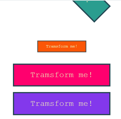
section:first-of-type h1:nth-of-type(1) {
    transform: rotate(45deg);
}
첫 번째 것만 45도 회전되었다.

section:first-of-type h1:nth-of-type(1) {
    transform: rotate(45deg);
    transform-origin: bottom right;
}rotate()는 보통 2차원 평면 위 기준점을 중심으로 요소가 회전한다.
rotateX() 는 X축, rotateY()는 Y축 같은 축을 중심으로 회전할 수 있습니다. +rotateZ()도 마찬가지이다.
scale()
scale()은 변형 기능은 요소의 크기를 변화시킬 때 사용할 수 있다.
크기를 확대하거나 축소할 수 있다. scale X, Y, Z, 3d등이 있고 scale만 상용가능하다.
section:first-of-type h1:nth-of-type(2) {
    transform: scale(0.5);
}
X축과 Y축에서 모두 크기가 줄어들었다. 절반 크기로 줄어들었다
값을 하나 이상으로 넣으려면?

section:first-of-type h1:nth-of-type(2) {
    transform: scale(2, 1);
}
높이는 동일하지만 너비가 두배가 되었다.

section:first-of-type h1:nth-of-type(2) {
    transform: scaleY(2);
}
scaleY(2)로 반대의 효과를 낼 수 있다. Y축 높이가 2배가 되고 X축 너비는 동일하게 유지되었다. \
Translate()
요소를 움직이는 기능이다. 오른쪽, 위, 아래 혹은 두 방향으로 동시에 움직일 수 있다.
translate(), translate3d), translateX(), translateX(), translatez()가 있다.
가로를 움직이고 싶으면 translateX()를 사용하면 된다. 여러 값을 쓸 수 있지만 길이나 비율을 쓴다.
길이에서는 em, rem, px, cm, in, %등 모든 단위를 사용할 수 있다.

section:first-of-type h1:nth-of-type(3) {
    transform: translateX(200px);
}
200px만큼 움직였다.
왼쪽 아래로 이동하게 시키고 싶으면 어떻게 해야할까?

section:first-of-type h1:nth-of-type(4) {
    transform: translate(-200px, 300px);
}
위의 코드처럼 입력했더니 왼쪽 아래로 이동했다.
skew()
요소를 2차원 평면상에서 기울이는 기능이다. skewX, skewY가 있고 각도, 라디안, 턴, 그라디안 등 넣을 수 있다.

section:nth-of-type(2) h1:nth-of-type(1) {
    transform: skew(30deg);
}
section:nth-of-type(2) 에서 h1:nth-of-type(1)에서 기울기를 변형을 해보았다.

section:nth-of-type(2) h1:nth-of-type(2) {
    transform: skew(10deg, 25deg);
}
skew(10deg, 25deg)입력을 하니 초록색 밑에있는 주황색 네모가 기울어졌다.
이렇게 한개 이상을 적용하거나 조합해서 사용할 수 있다.

section:nth-of-type(2) h1:nth-of-type(2) {
    transform: rotate(90deg) scale(1.2);
}
위의 코드와 같이 입력하면 동시에 커지면서 회전할 수 있다.
변형 함수는 콘텐츠나 요소에 상관없이 적용가능하다. 예를 들면 <h1>에서 버튼이 있다면? css설정에 맞게 세로로 늘어났다.

'📦 CSS > CSS' 카테고리의 다른 글
| [CSS] Background (0) | 2022.11.24 |
|---|---|
| [CSS] hover 효과를 이용한 button (0) | 2022.11.24 |
| [CSS] Transition(CSS 전환) (0) | 2022.11.14 |
| [CSS] Position Property(위치 속성) (0) | 2022.11.14 |
| [CSS] 알파 채널 | Opacity(불투명도) (0) | 2022.11.10 |